Internet Association Branding
Internet Association was a trade association that represented over 40 internet companies–from Amazon and Airbnb to Zillow and Ziprecruiter–at the state, federal, and international levels. In 2016, I was brought in to professionalize and grow the IA brand, develop and implement creative processes and best practices, and eventually–proving the success of the new creative in the association–grow the team. Throughout my time at IA I was fortunate enough to be able to wear the many hats one typically does in a startup. This section is about the overall brand evolution during my time as Creative Director at the association.
Iteration instead of reinvention:
⬑ 2012-2015
⬑ 2016-2017
⬑ 2018-2021
⬑ 2021-2022
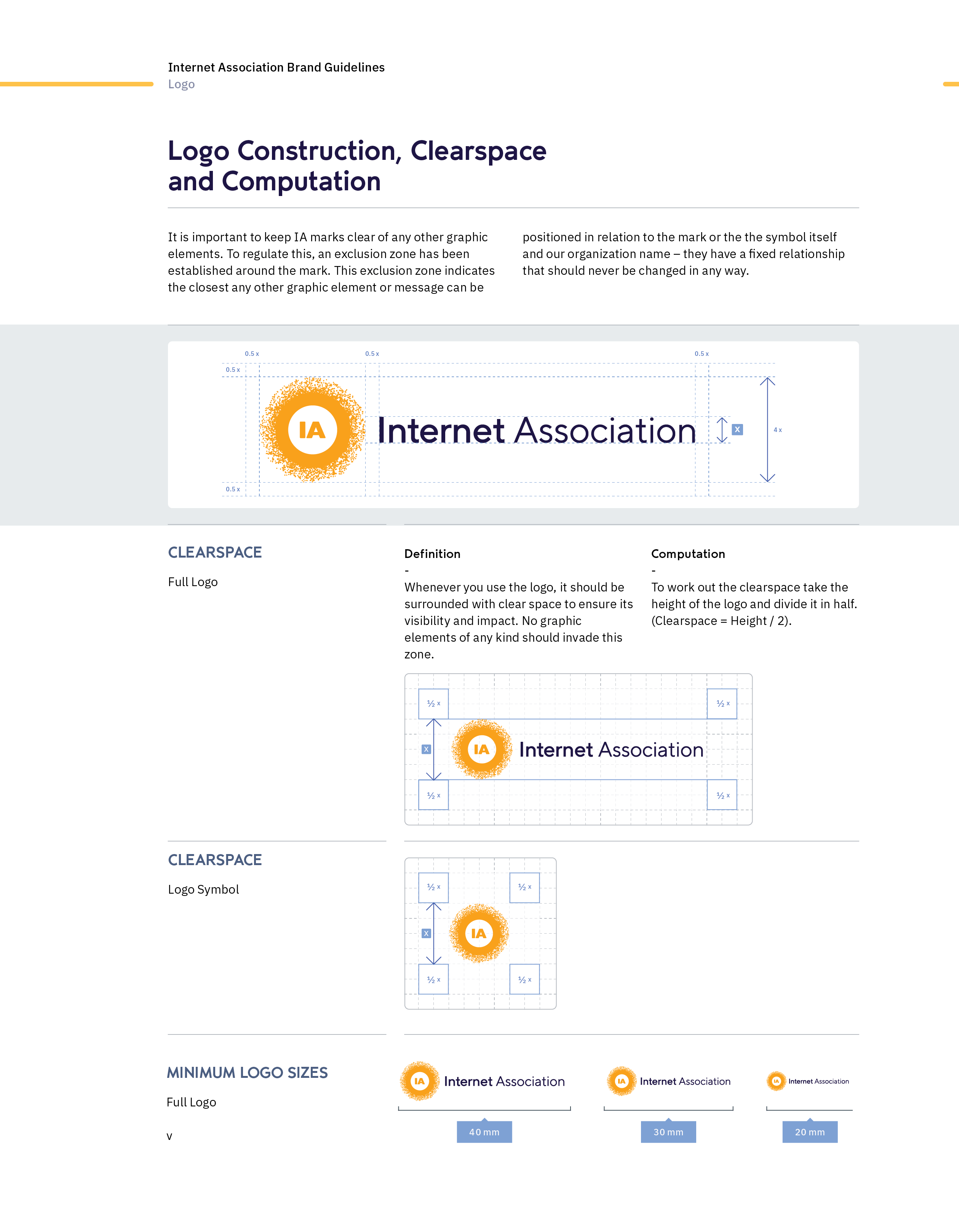
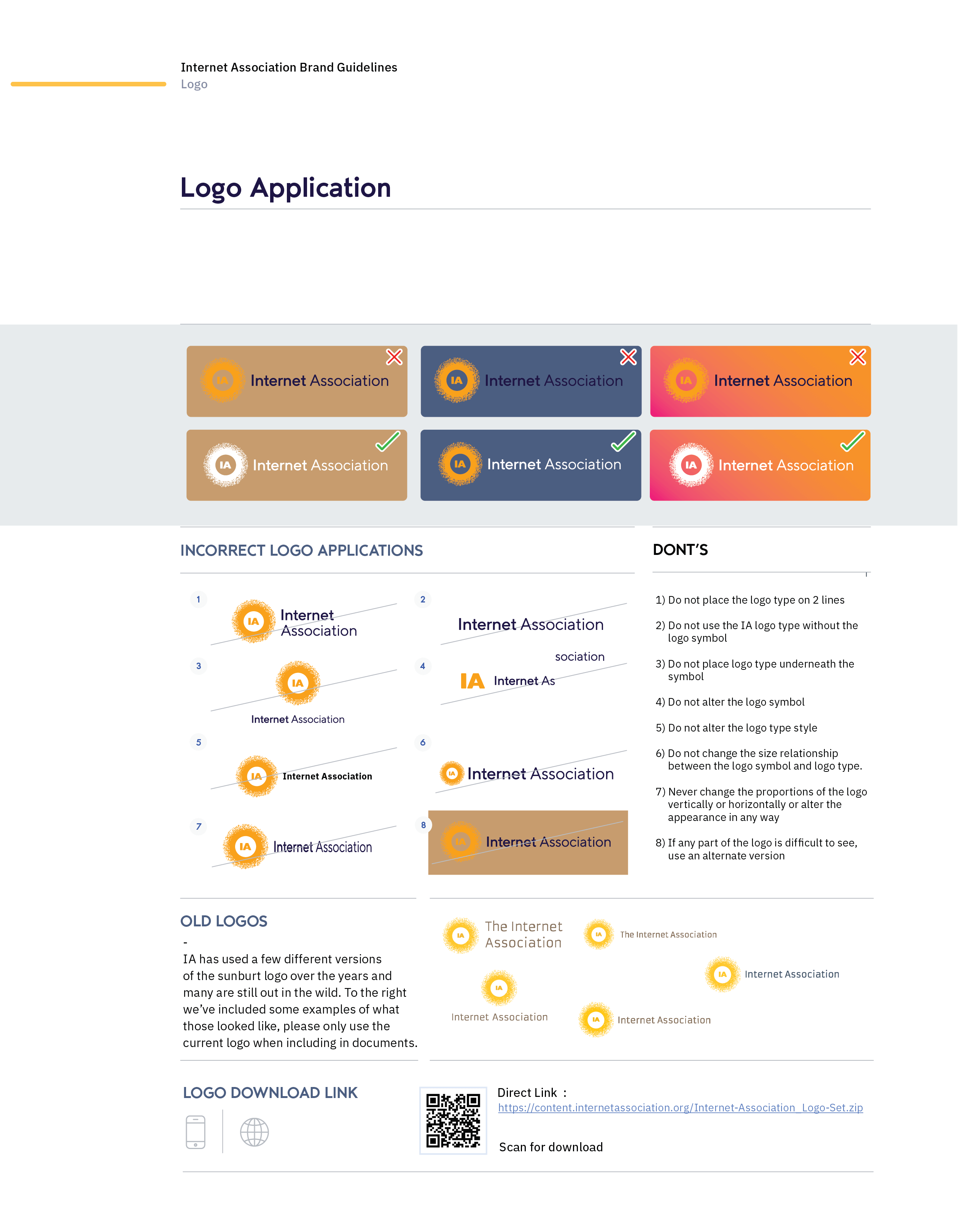
This was a case where stakeholders liked the logo, but in its original form it was challenging on multiple levels. The proposal to the stakeholders was to retain the core of the logo but address some chief concerns. The core problems and solutions were:
| 01 | Problem: | Readability when the logo is used at small sizes or low resolutions |
| Solution: | Modernize the type to a weightier, modern geometric type | |
| 02 | Problem: | Typeface style and color were outdated |
| Solution: | Change the logotype color from brown to a dark blue | |
| 03 | Problem: | Logo as an SVG is too complicated |
| Solution: | Eliminate as many points as possible in the sunburst to reduce file size, making it more performant on websites | |
| 04 | Problem: | Logo mark either fluoresces too often, becomes unreadable, hidden, or all the above at once |
| Solution: | Simplify, darken and fill in more of the sunburst |
Since we had a small team and limited time, (we needed to walk and chew gum at the same time) we decided on iteration instead of revolution. The evolution of the logo (and brand) would not happen all at once, but rather iteratively– using prior rollouts, successes and failures, to guide the brand to where it is today.
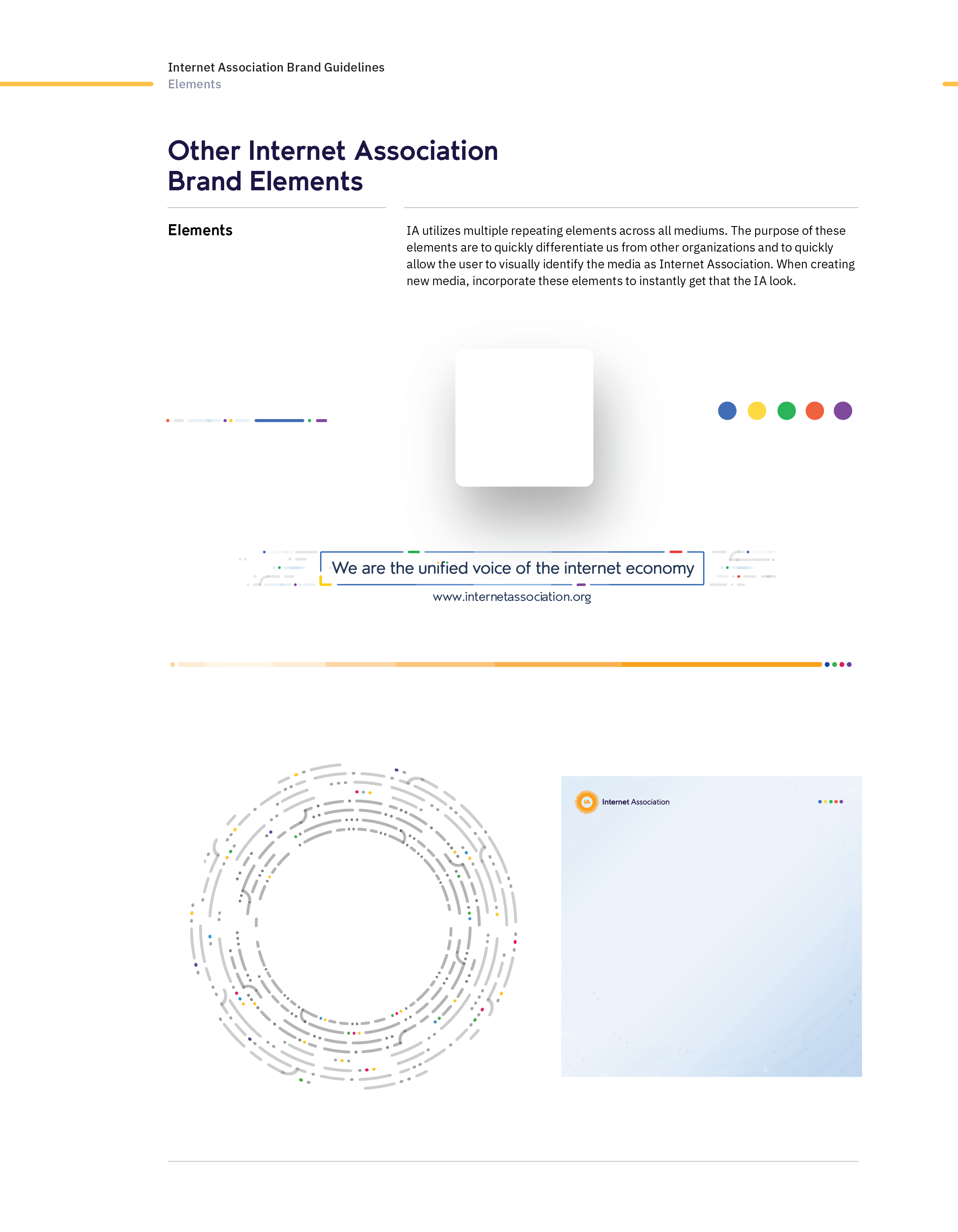
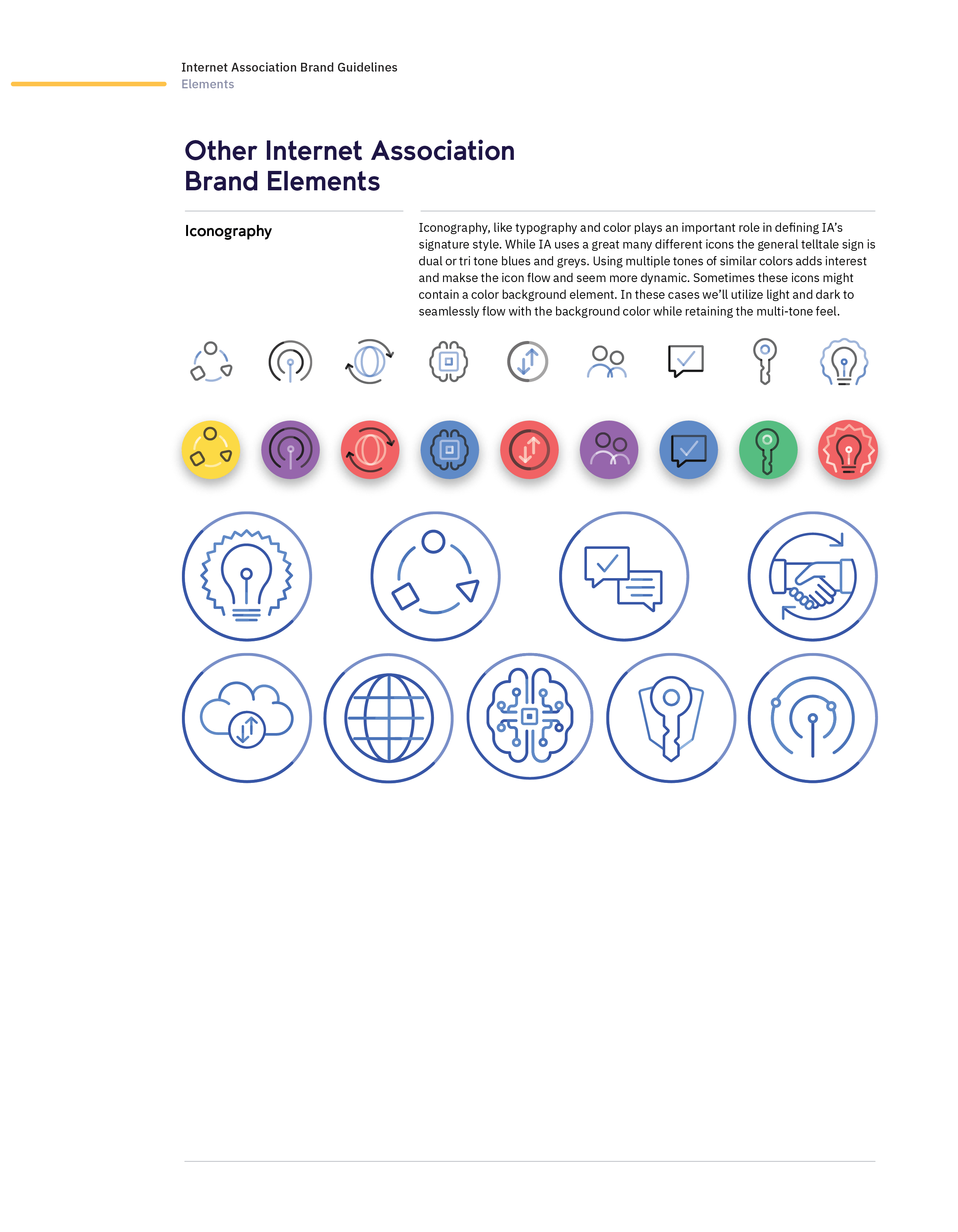
↳ Branding Elements
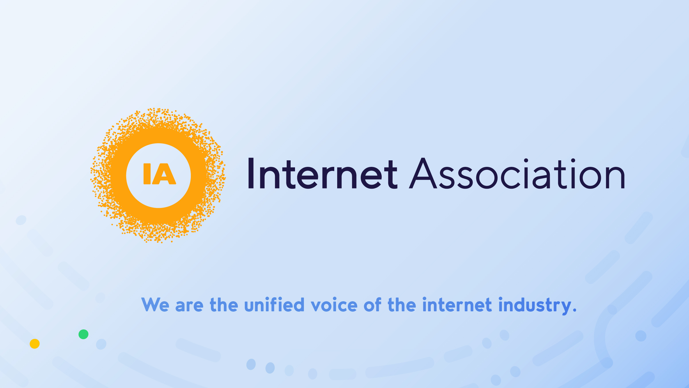
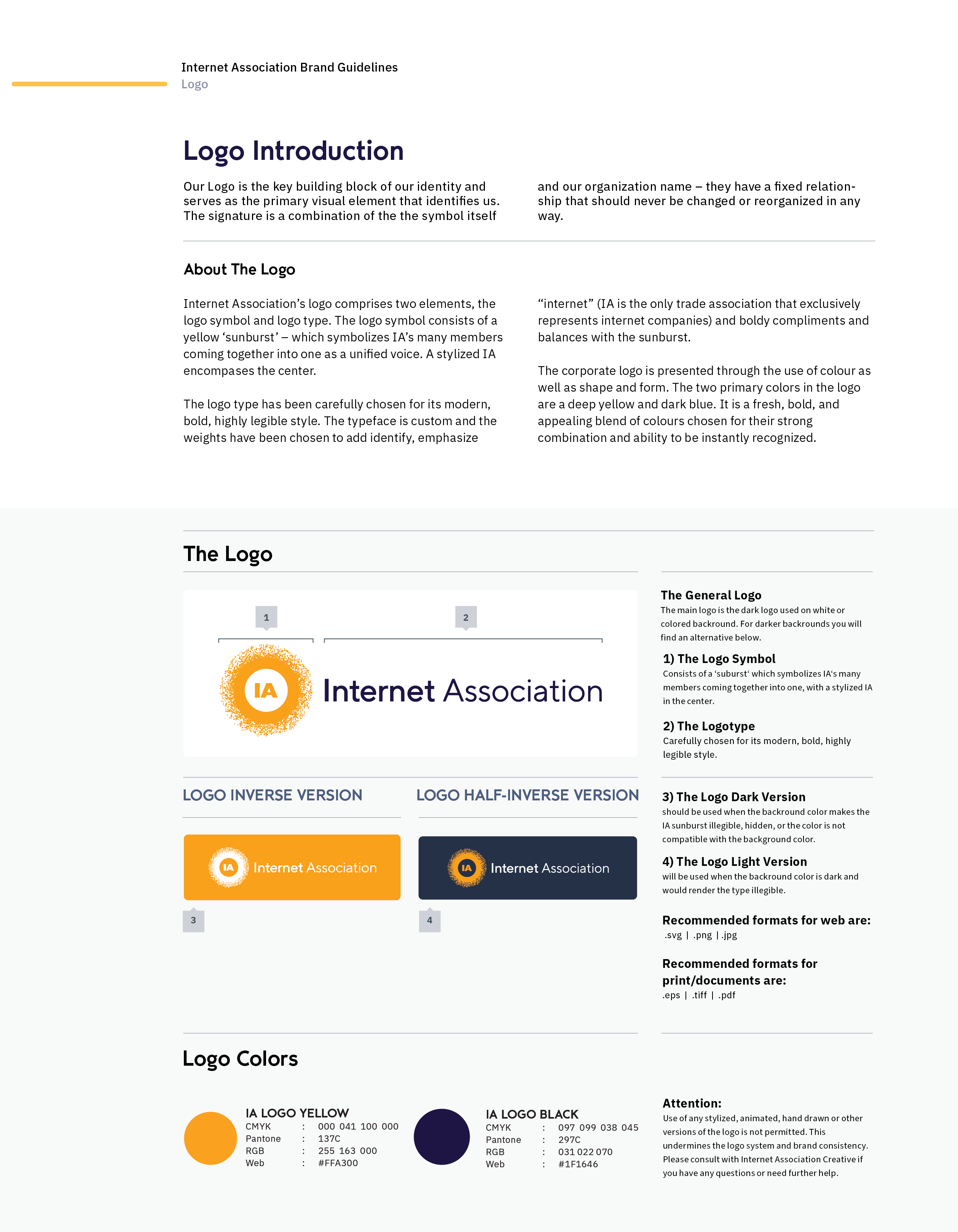
The entire re-branding ethos revolved around a simple idea: what if IA were one of the companies it represents? Use the recognizable industry design traits to communicate industry ideas to various levels of government who would inherently be familiar with it while being recognizable on its own merits.
The result is a style that was well-known on Capitol Hill.
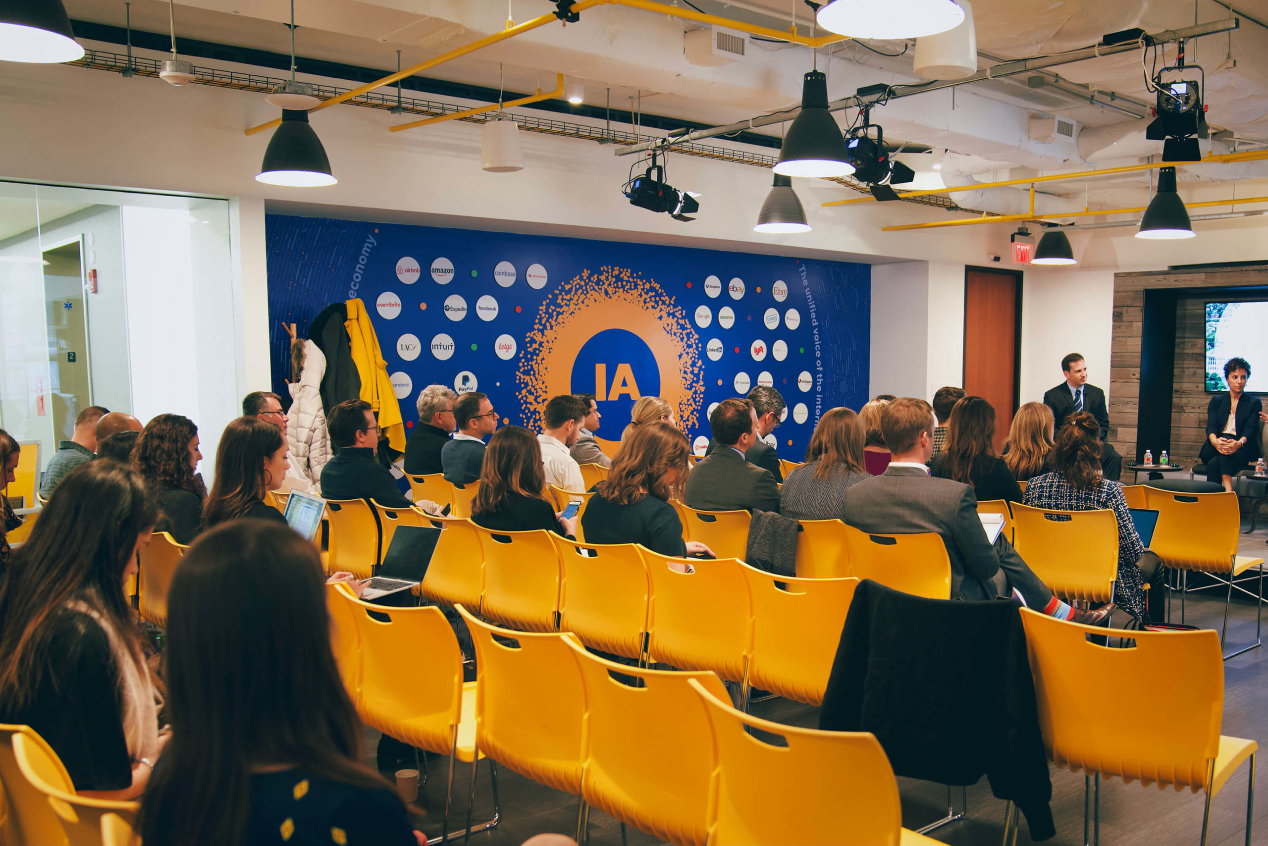
A view of IA's Brand Wall. The wall needed to be flexible as members change from time to time or update their logo, so the wall is designed with a vinyl backdrop and neodynium magnets, which hold printed circle acrylic 'bubbles' featuring member logos.
↳ Bringing it all back home
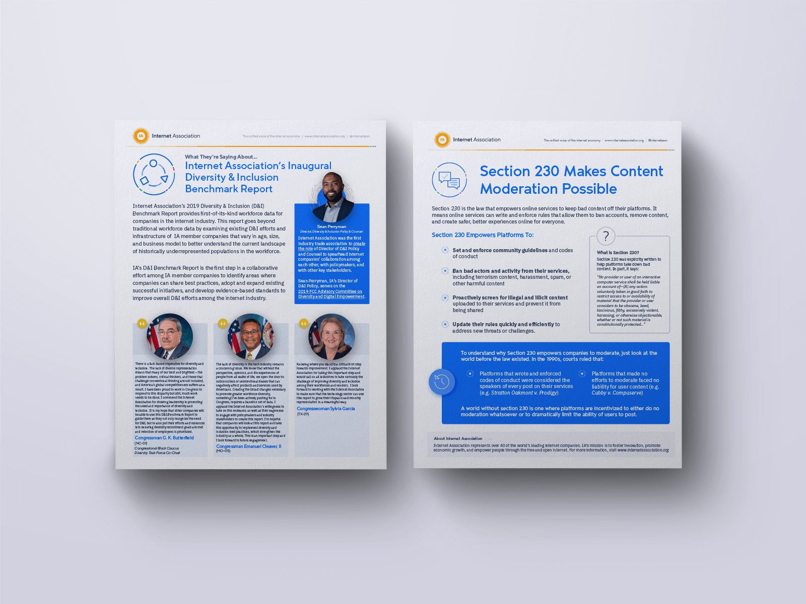
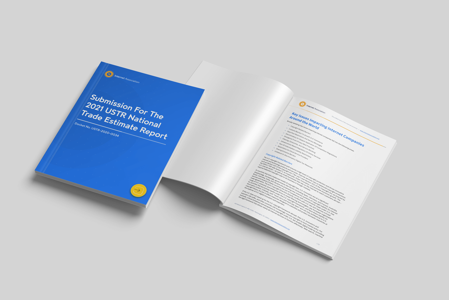
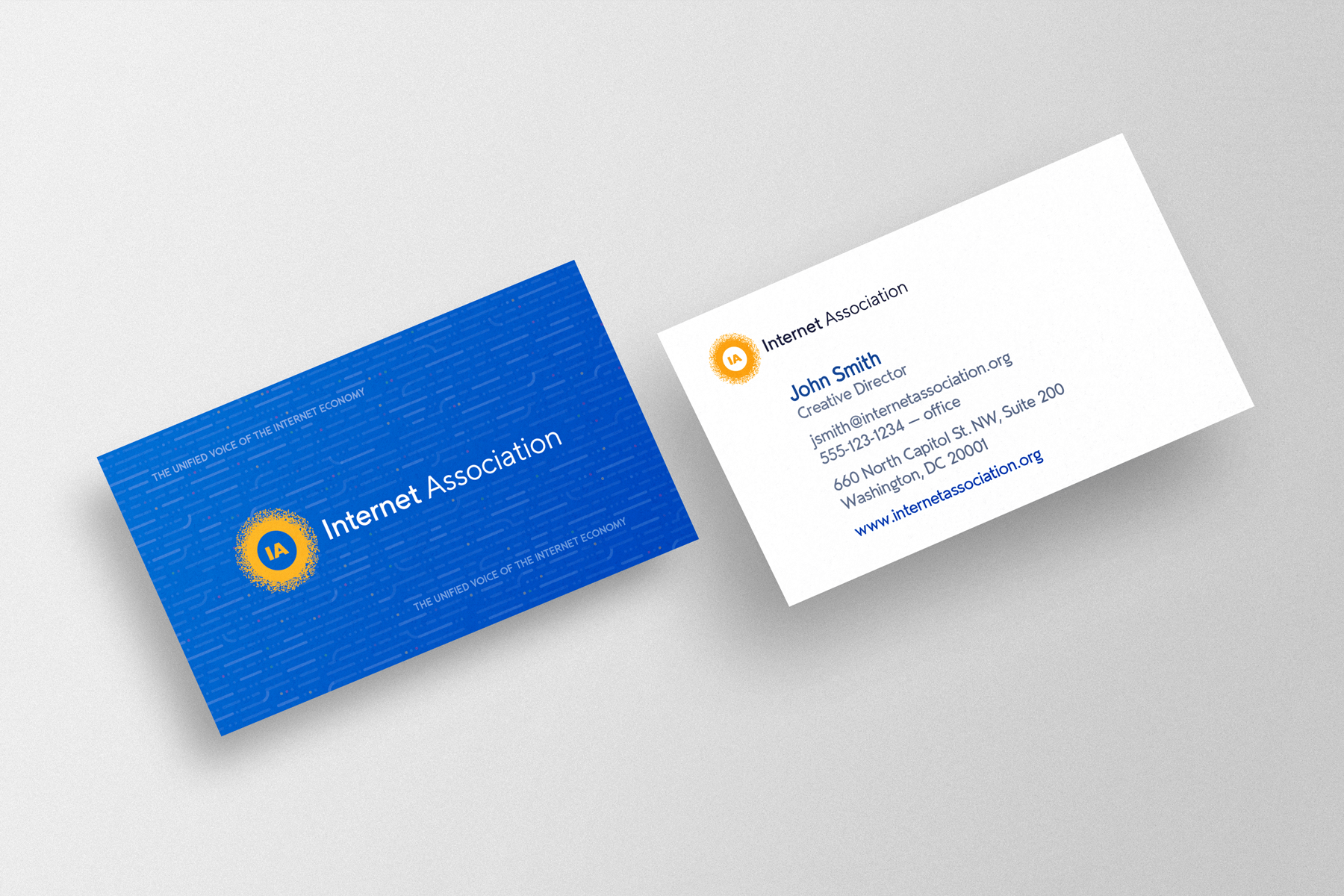
Together, the Creative and Communications Team worked to incorporate new and existing design elements (logo, fonts, and color palette), iterated where necessary and creating missing pieces to turn them into a suite of well designed, cohesively-branded materials– allowing the association to speak with a unified, cohesive voice.
© Typetonic 2021-2022